Zeki
10 years
Posts: 122 
|
Post by Zeki on Nov 6, 2015 8:38:14 GMT -7
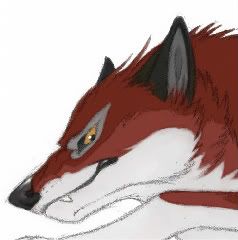
Coming out next week is a new edition of GDR, and I think the cover art is horrible.  There is no reason for Gin to be there, but Akakabuto looks absolutely awful! His head is so tiny and his pecs are gigantic. Ah, well. I'm a little surprised it's even getting a 3rd edition. It's not like it's popular, is it? |
|
Deleted
Deleted Member
Posts: 0
|
Post by Deleted on Nov 6, 2015 9:05:45 GMT -7
Yep, Akakabuto looks... A bit disproportionate. That's definitely the first thing I noticed in the image. Again, the presence of Gin continues the tradition of misleading titles and cover images (think GDA). But at least he looks cute!  Other than this, GDR is a good story that I enjoyed a lot. So I'm happy to see it's getting a new release. |
|
|
|
Post by Ace on Nov 6, 2015 9:21:36 GMT -7
To say something positive about the cover, I do like the background, but yeeeah... Akakabuto looks awkward as hell.
I am a little sad that Yoshi never uses Shiro on any covers. It would have made more sense to have Shiro on the cover rather than Gin.
|
|
Durango
Legend
just end my fckn life (✿◠‿◠)
Posts: 440 
|
Post by Durango on Nov 6, 2015 10:39:29 GMT -7
That cover could've easily had Shiro in Riki's place and Riki in Gin's, but... nnnnnnope, Yoshi is giving us none of that. But I do think that while Gin has no business being there, he is still absolutely adorable! If the characters were changed and Akakabuto made look better, then this would be a really cool cover.
|
|
Ryan
Legend
This is my poochyena, his grandfather was a houndoom
Posts: 364
Hated Characters: hyena
Fav Characters: weed, gin, rigel,
Fav Story: GNG, GDW, GDW; O, SSY
|
Post by Ryan on Nov 6, 2015 11:25:16 GMT -7
I like the first edition cover better.The new one looks more like fan art 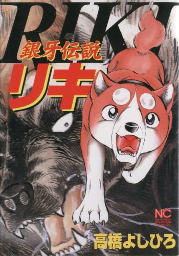 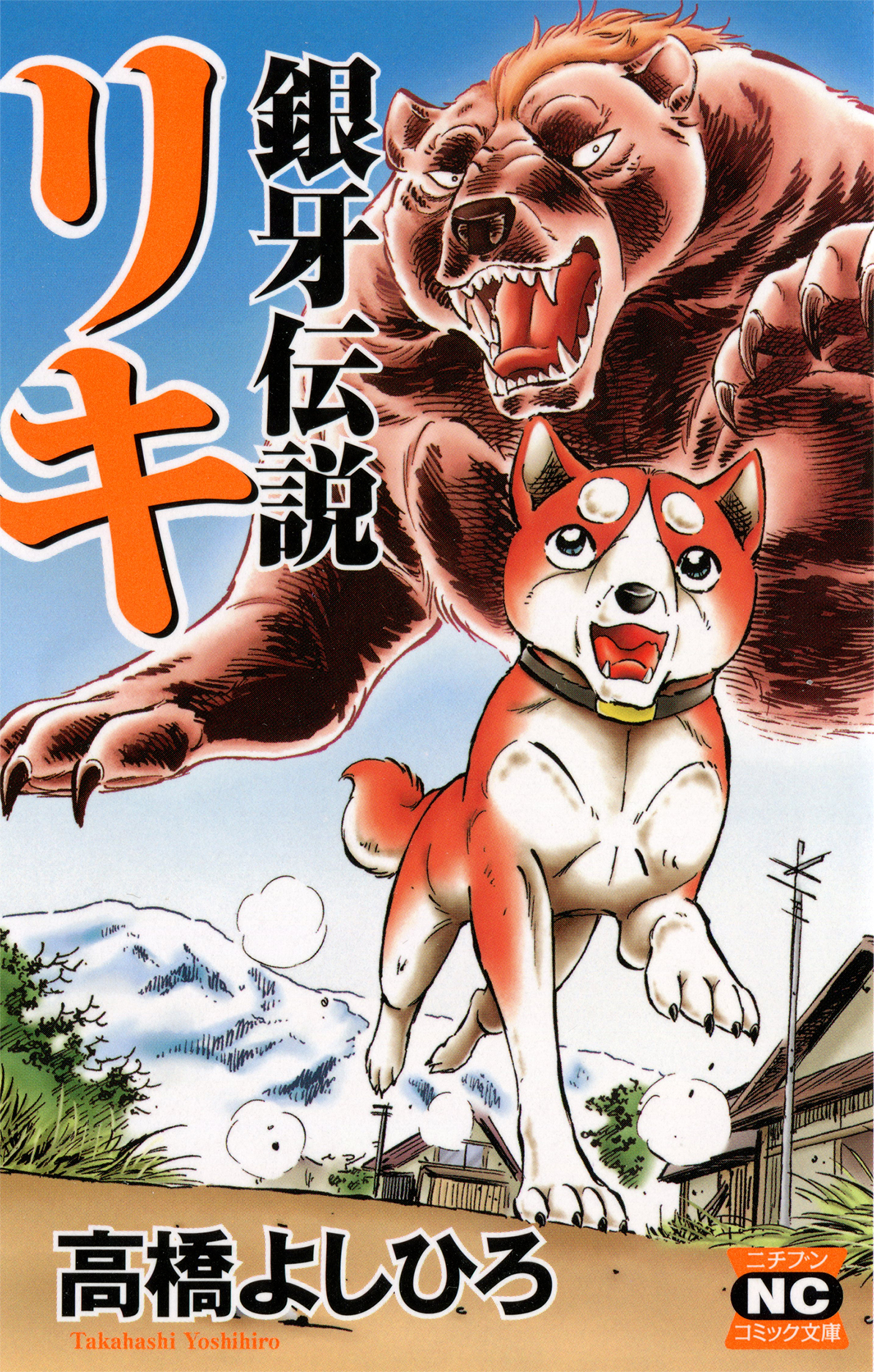 First and second edition covers for comparison to the new one |
|
|
|
Post by Kit on Nov 6, 2015 12:24:29 GMT -7
I think Riki actually looks worse than Akakabuto, since that bear had weird-ass "tiny head, huge body" proportions, even in GNG. Riki is so retina-searing orange that I can't look directly at him without squinting, and the newer, lazier design of him with the giant head-balls just... Ugh. My complaints about general art style aside, he just looks gross, to me, and Yoshi doesn't even keep his character design consistent.
Gin's expression IS pretty adorable, though, and he doesn't look quite as Weed-like as Yoshi's been making his younger self look, more recently. The mountain background is pretty cool, too. It's really nice to see him getting back into painted backgrounds, after GDW and GDWO's stock photo ones.
As for why it's getting a new edition now, I have no clue. I don't THINK it did too well in Japan, but maybe it did well in Finland? I don't know if abroad sales can effect reprints.
|
|
GingaFreak
Pup
The only thing we have to fear is Giant Man Eating Spiders
Posts: 11
Hated Characters: Hougen And Kamakiri
Fav Characters: Riki, John and Joe
Fav Story: Ginga Densetsu Weed
|
Post by GingaFreak on Aug 1, 2016 16:00:09 GMT -7
at least Gin looks cute though |
|